Growth Operations
Design • Art Direction • Brand Identity
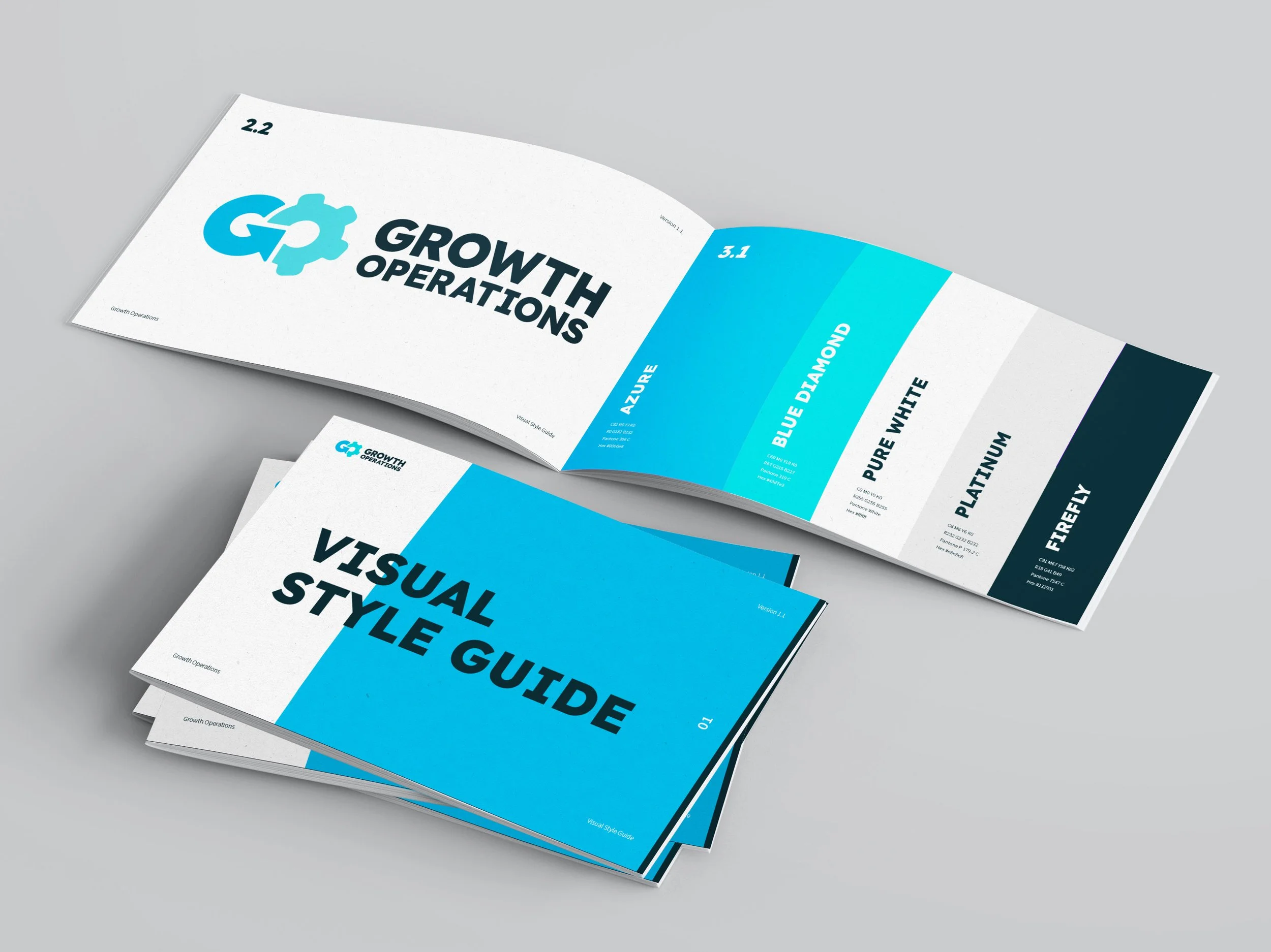
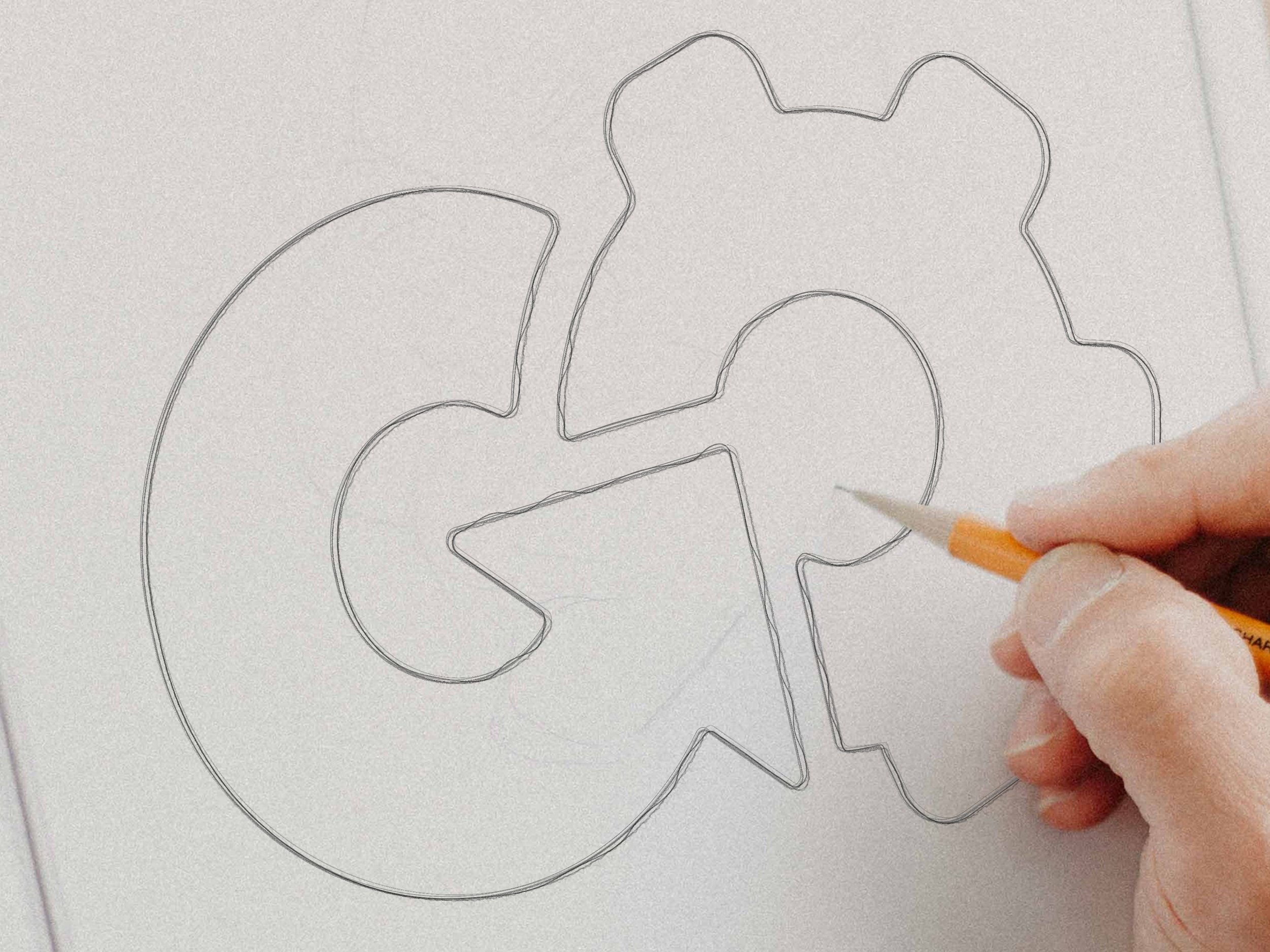
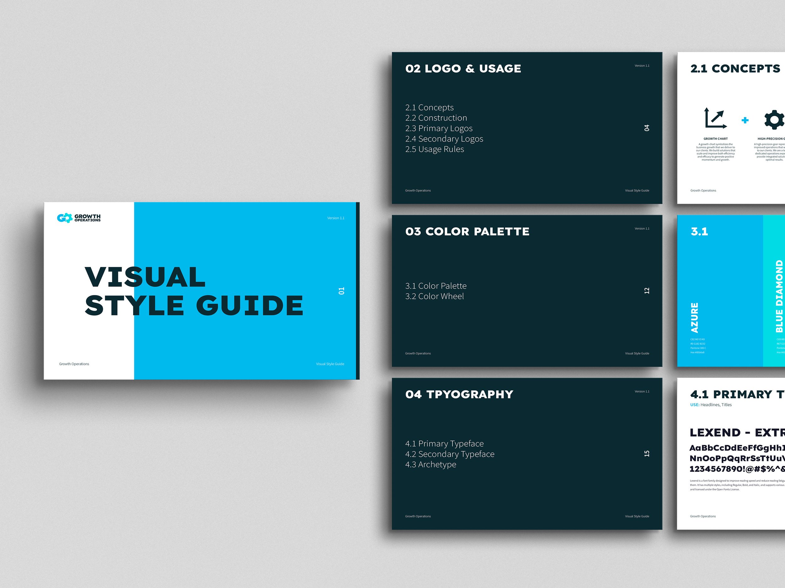
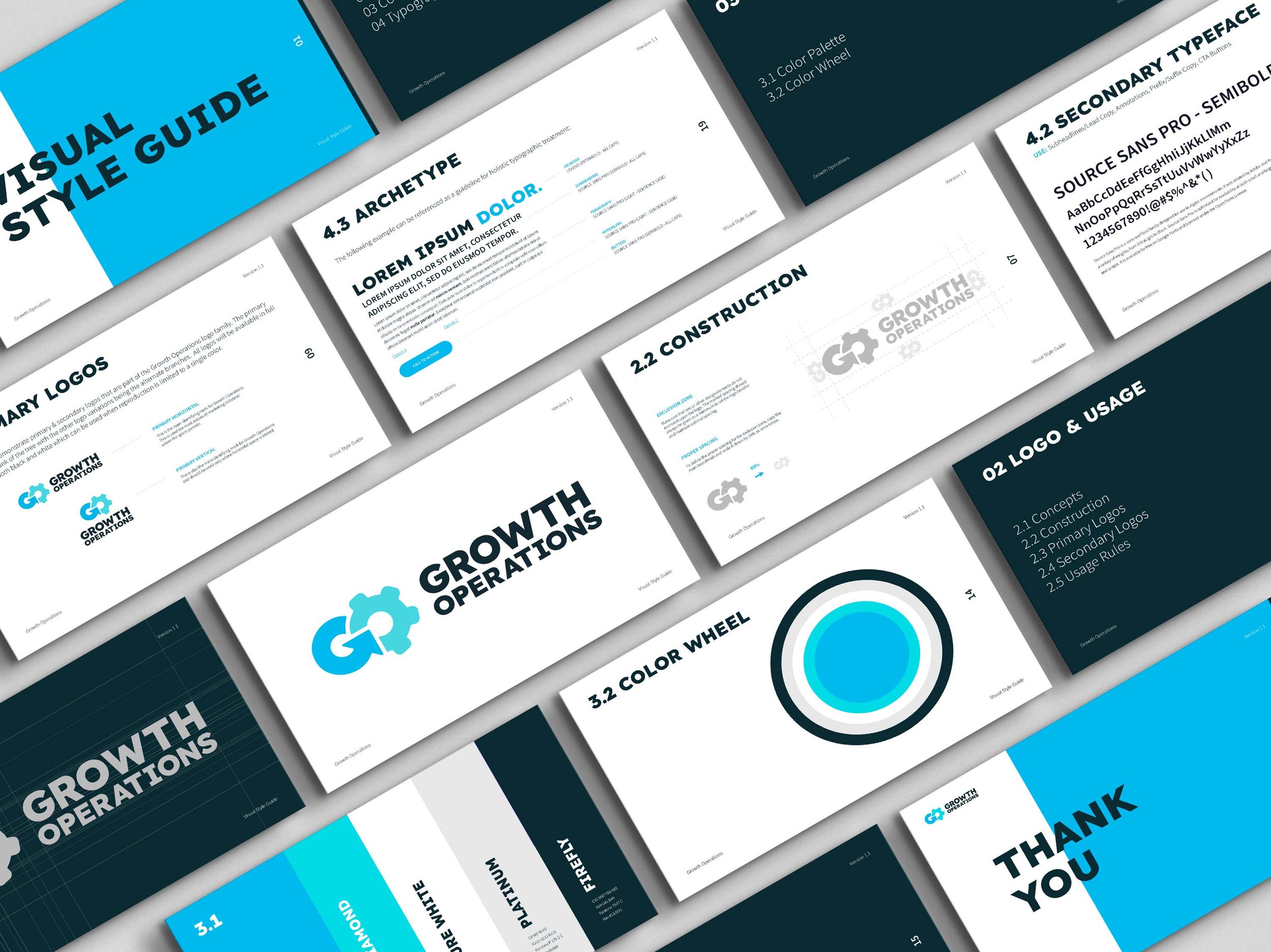
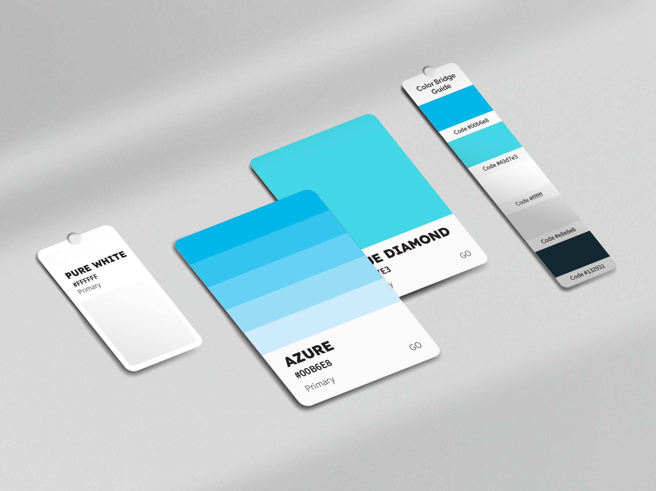
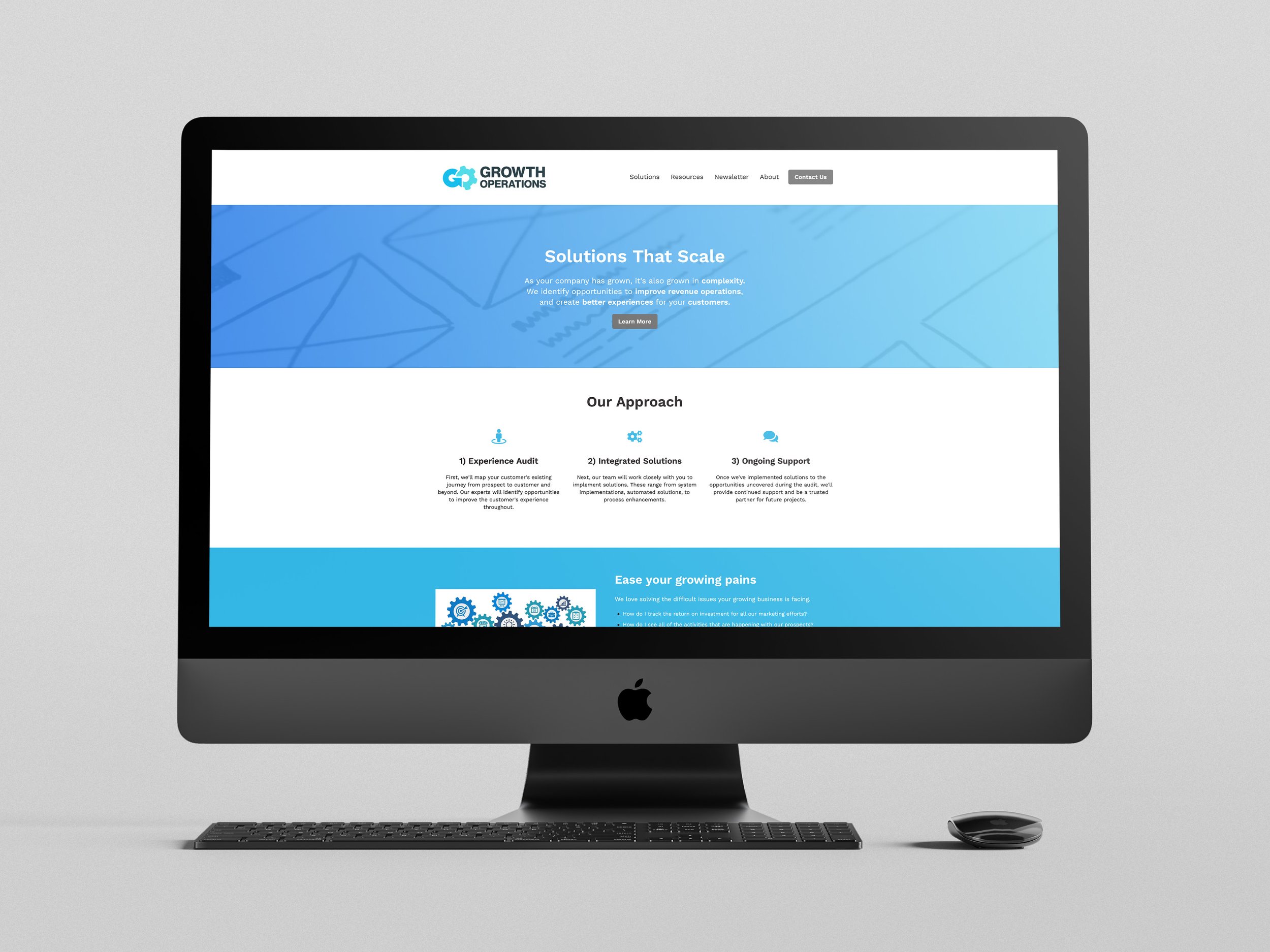
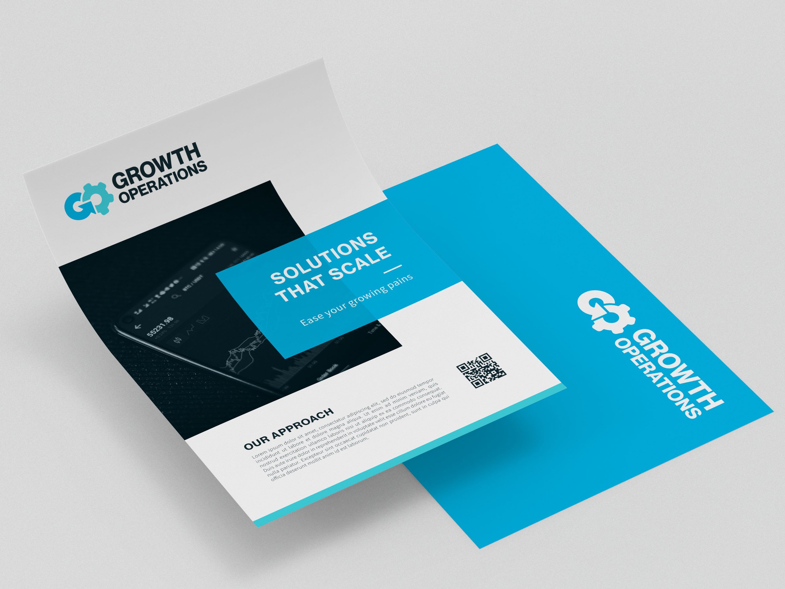
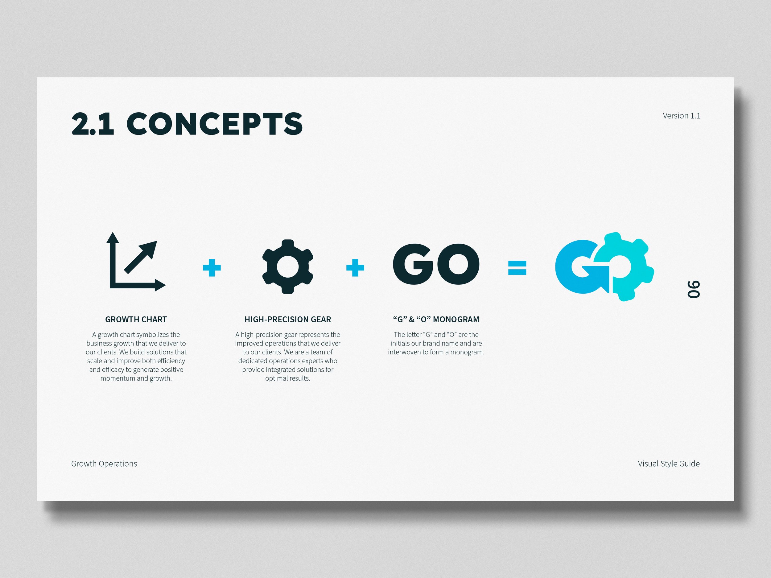
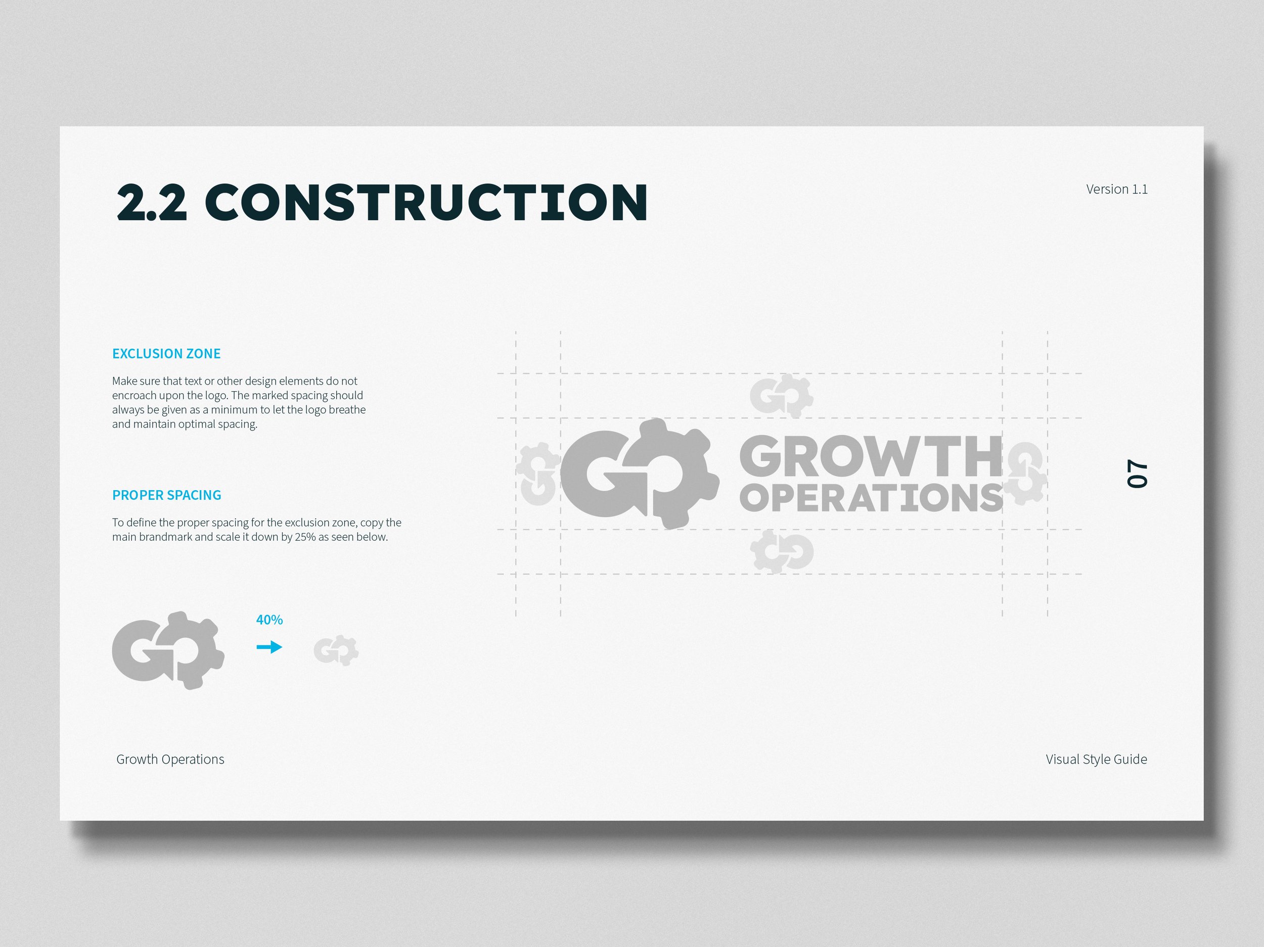
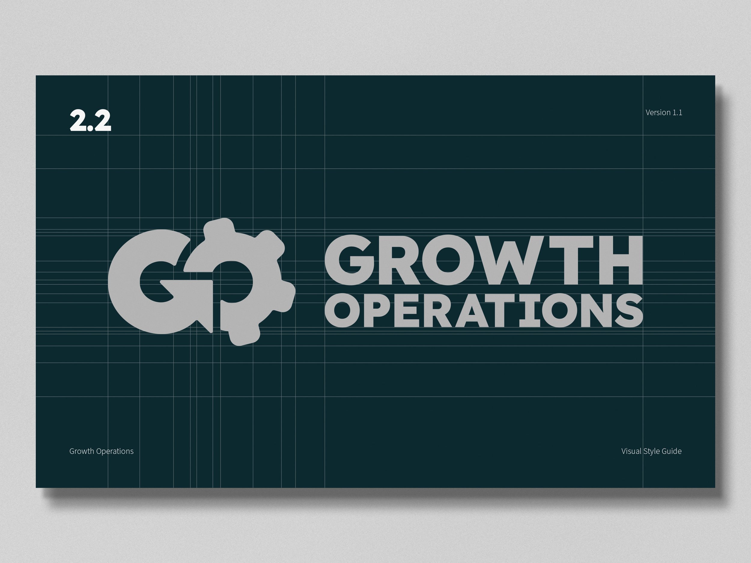
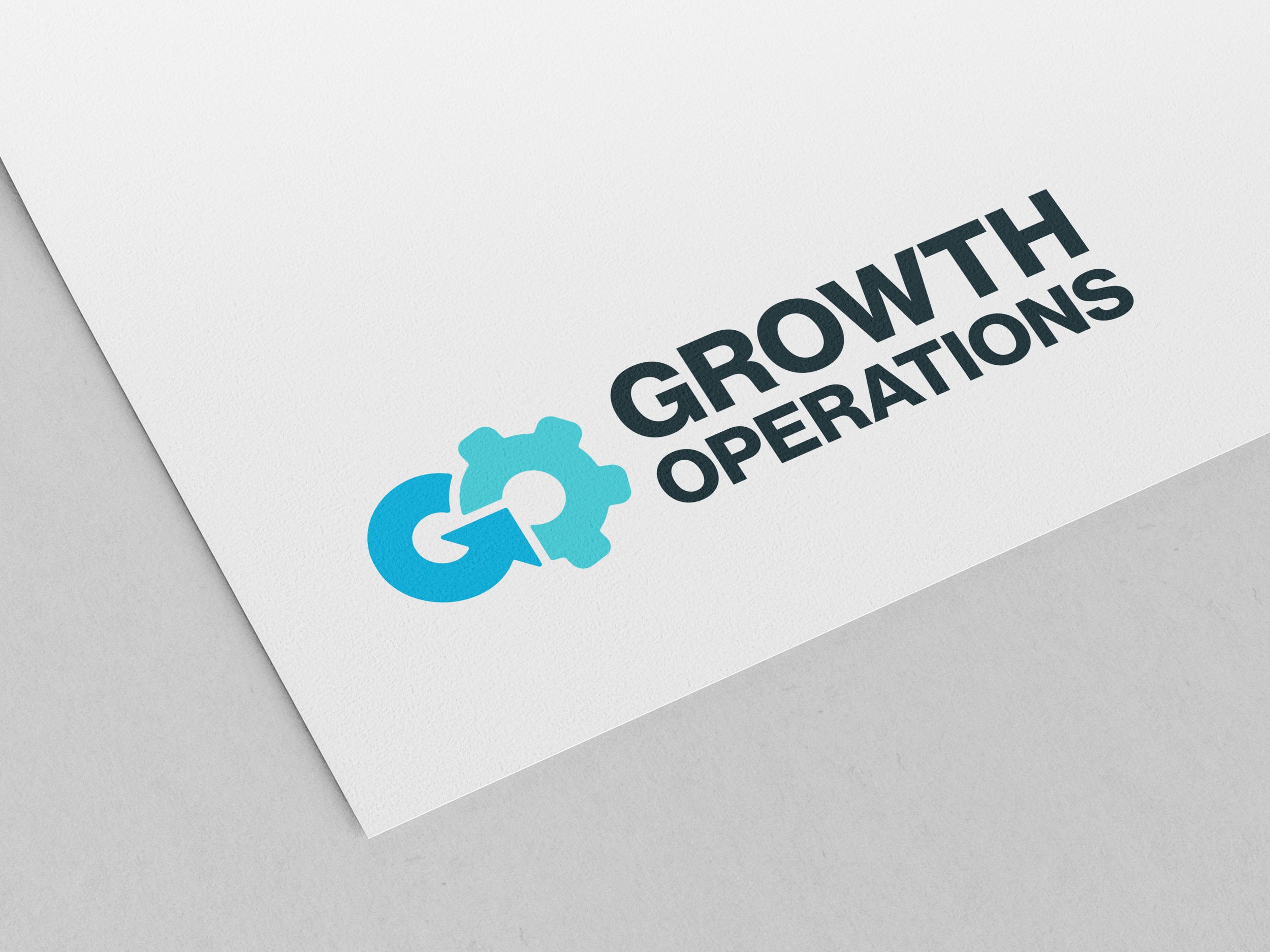
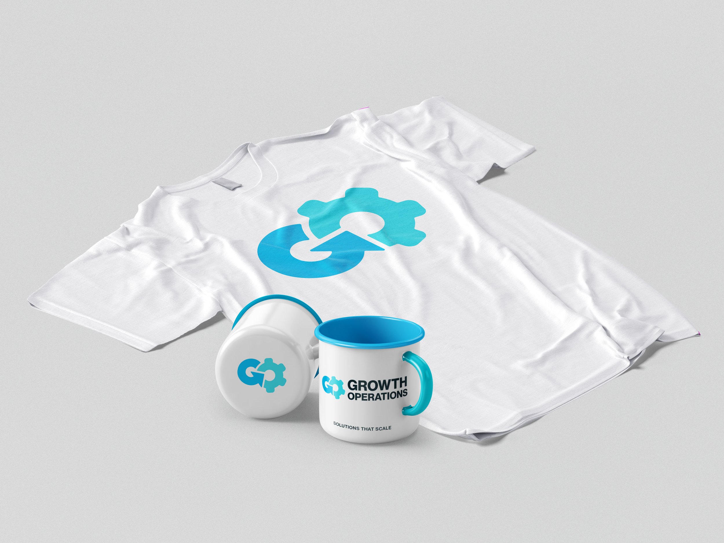
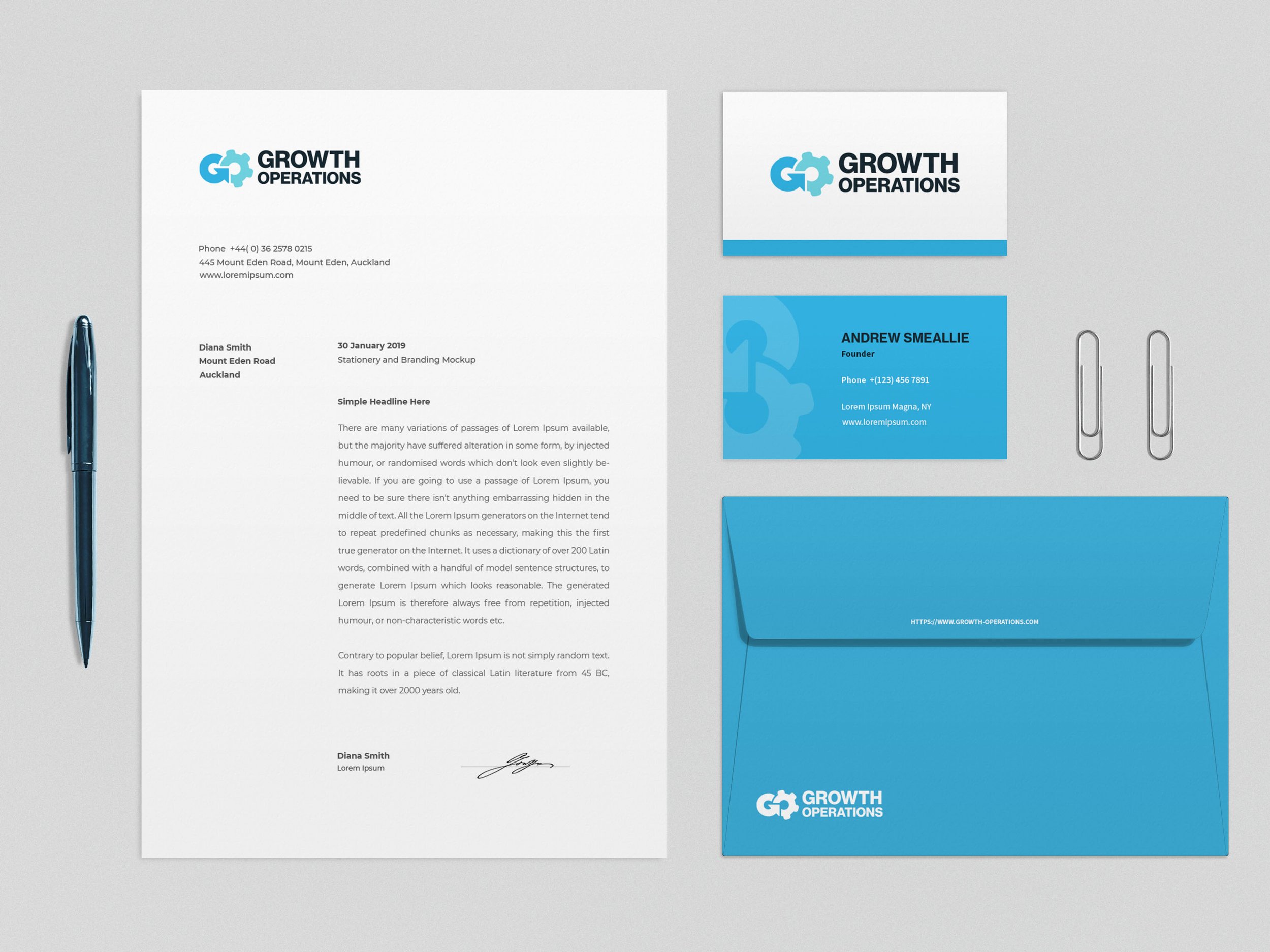
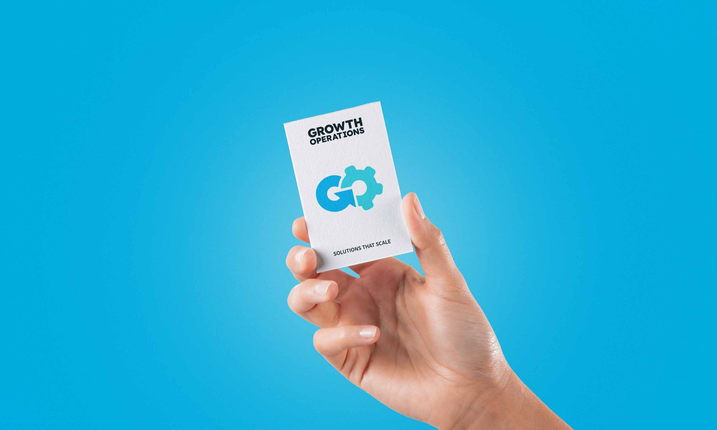
For Growth Operations, I designed a visual identity that embodies growth, precision, and operational excellence. The custom monogram logo seamlessly integrates the "G" and "O," with an upward arrow symbolizing scalable growth and a gear representing efficiency and innovation. A refined color palette of Azure, Blue Diamond, Pure White, Platinum, and Firefly reinforces trust, sophistication, and modernity. Every design element works together to position Growth Operations as a leader in delivering impactful solutions with clarity and confidence.
